Product photography can make or break your sales.
A good product photo will make shoppers click that “Add to Cart” button.
Subpar product photography will send your shoppers running to another online store.
So how do you make sure that the photos on your site make shoppers add to cart?
Keep reading for the complete guide on how to take high-quality product photos for your Wix store!

How to take high-quality product photos for your Wix store
When it comes to selling online, 93% of shoppers say the way things look online is key when deciding to buy a product.
This makes sense. After all, would you buy a pair of shoes based on description alone? Never!
The same goes for any product you are selling online.
You need to provide your customers with enough visual information to make the right decision.
Product photos set expectations
Not only will having product photos help with sales, but they will also help you set shopper expectations.
Having accurate product photos will give customers a good idea of what they will get in the mail.
When expectations are properly set, your customers will likely be happier with your product.
And happy customers write great reviews.
So you see that good product photos = set expectations = improved sales = happy customers = great reviews!
To take these product photos, there are four crucial steps you need to take
- Get the right equipment
- Style your shoot
- Shoot the right angles
- Edit your photos
Equipment you'll need for product photography
The right photos start with the right equipment.
To shoot the best product photos for your Wix store you’ll need:
- Camera
- Lighting
- White background or consistent background
- A table
- Tripod
Camera
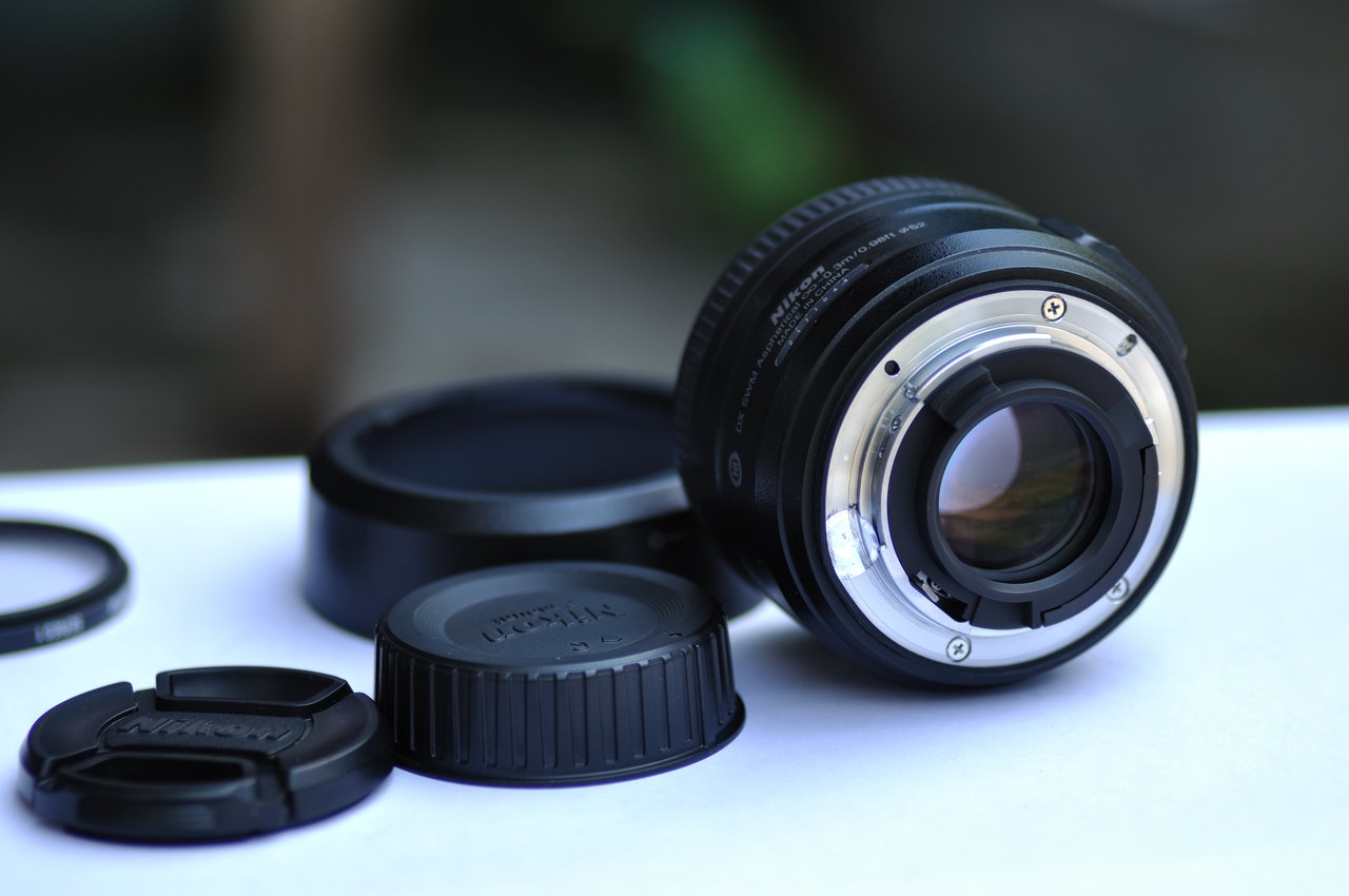
Now you don’t have to get too fancy with your camera. In most cases, a smartphone will do.
According to Quora, the main criteria for a camera is that it works.
You can choose between a Canon of a Nikon and get a used one with low shutter counts. You can definitely spend less than $300 on a used camera that will take great photos.
It’s not about the camera, it’s about the photographer
Almost any DSLR with a 50 mm lens will do. However, the most important thing to consider is lighting!
Lighting
Next up we have lighting.
Which light is best for product photography?
For product photography, the best light is natural light. You should be shooting your product photos in front of a window ideally in the morning around sunrise or before sunset.
The best score for natural light is on a cloudy/overcast day, and you should always avoid shooting at noon because of the harsh light it will give your products.
If you don’t have any natural light, you can chose a continuous light source that mimics sunlight.
Using LED bulbs are the best for this.
You can also pick up a ring light or lighting kit online for natural light results in a studio setting.
How do you photograph products with natural light?
The best way to photograph products with natural light is to position your product at a 90-degree angle from your window.
You can then use something like a bounce card to ‘bounce’ the light back onto your product. This will ensure your product photo has fewer shadows!

White background or consistent background
The next thing you need to have for your product photos is a white background or a consistent one.
White backgrounds are great for your feature image and keeping your store looking consistent.
White background options for product photos
- Lightbox
- Poster paper
- Cloth backdrops
Just remember that your white should be pure white and not off-white!
If you aren’t all about white backgrounds, you can opt for a consistent background that reinforces your brand.
In general, white is the way to go for primary images, and different backgrounds are great secondary images, but if you are just starting your store and are DIYing everything, a different background is fine!
We’ll talk about different backgrounds and photo styling later in this post.
A table
The next thing you will need for your product photos is a table.
While this might seem obvious, you want to make sure that your table is at a comfortable height, and placed correctly by your light source.
It’s a bonus if you choose a table that is also white or fits your brand colors.
Tripod
Aside from lighting and a camera, this is essential for your product photos.
But why do you need a tripod? Won’t your hands work just fine?
Well, no.
A tripod ensures that you
- Avoid blurry photos
- Get consistent shots for every product
- Take photos faster
You can use a tripod for your DSLR or a phone stand that comes with a ring light!
Style your shoot
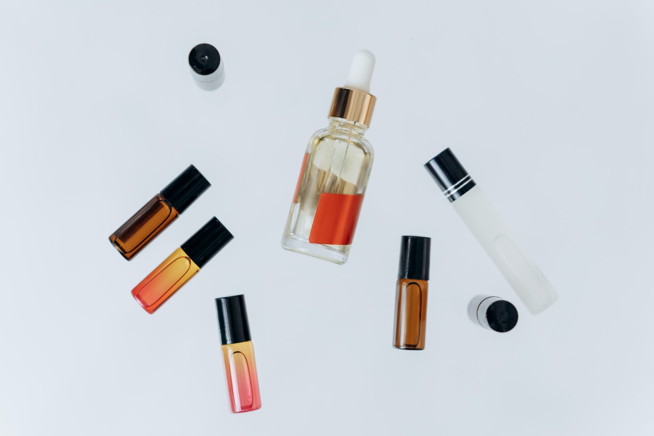
If you don’t want to go for the plain-jane white background, you can style your shoot with a branded style background.
Many Wix and independent Shopify stores are opting for styled photos as product photos. This works really well for lifestyle products that people want to envision themselves with or in.
How do you style a product photoshoot?
Choose Your
- Background
- Color palette
- Props
- Model(s)
The best backgrounds for product photography
When you are choosing a background, keep in mind that these ones are the most popular for product photography:
- White
- Plants
- Wood
- Marble/Tile
- Mirrors
- Paper (colored or patterned)
- Fabric
Choose a background that fits your aesthetic and brand!
Select a color palette
After you have chosen your background, you’ll want to stick to a color palette that resonates with your customers and fits your brand.
We recommend keeping your palette neutral and letting your product shine.
But only you can determine what is right for your brand.
If you are starting out, make sure you have a brand guide to follow and if you are not new to the online store game, make sure you are following your brand guidelines ;)
Choose props
Again, it’s important that you choose props based on your brand and ideal customer.
Classic props include
- Plants
- Ribbons
- Knick-knacks
- Vintage items
- Anything that your customer would use with your product (like a spoon with your bowls)
Choose a model
Finally, you can choose to have a model in your product photos.
This is going to be a good move for any product people wear or interact with on a regular basis.
You can even choose animal models if you sell things like pet beds or accessories.
Make sure that your model looks like your demographic and is in a setting that your shoppers can relate to.
Shoot the right angles
Now that you have your equipment and your styling, you are going to need to hit them angles!
There are four basic ones you should have in all your product listings (which will be listed first), but the more angles the better.
The best angles for product photos
- Straight on: a photo shot at eye level
- Bird’s eye: a photo shot from directly above
- Low angle: a photo shot from below the eye line, pointing upwards
- High angle: a photo shot from above the eye line, pointing downwards
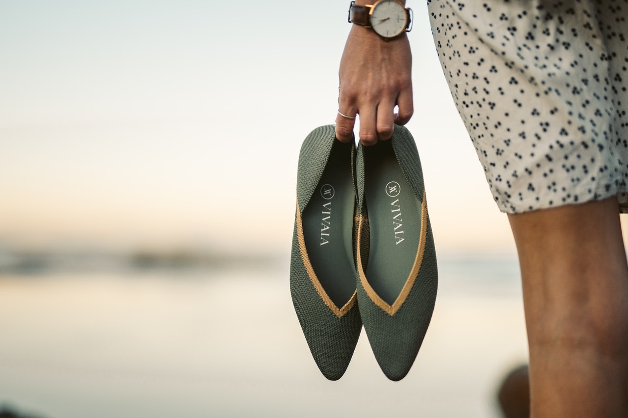
- Lifestyle: a photo that shows customers how the product looks in real life/in use
- Scale: showing what a product looks like next to a standard object like a coin or hand
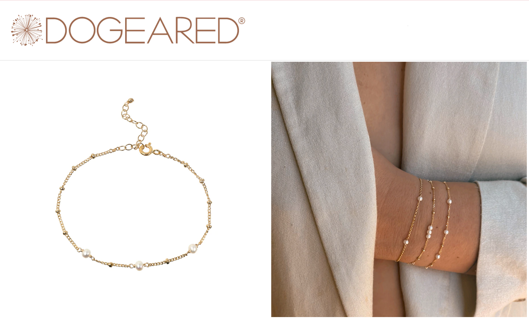
- Detail: Zoomed in, close up, and specific details of a product
- Packaging: Showing how the product looks packaged (important for gift type products)
Here are some examples of these angles
Photo angle examples
Example of Scale

Example of Bird's Eye
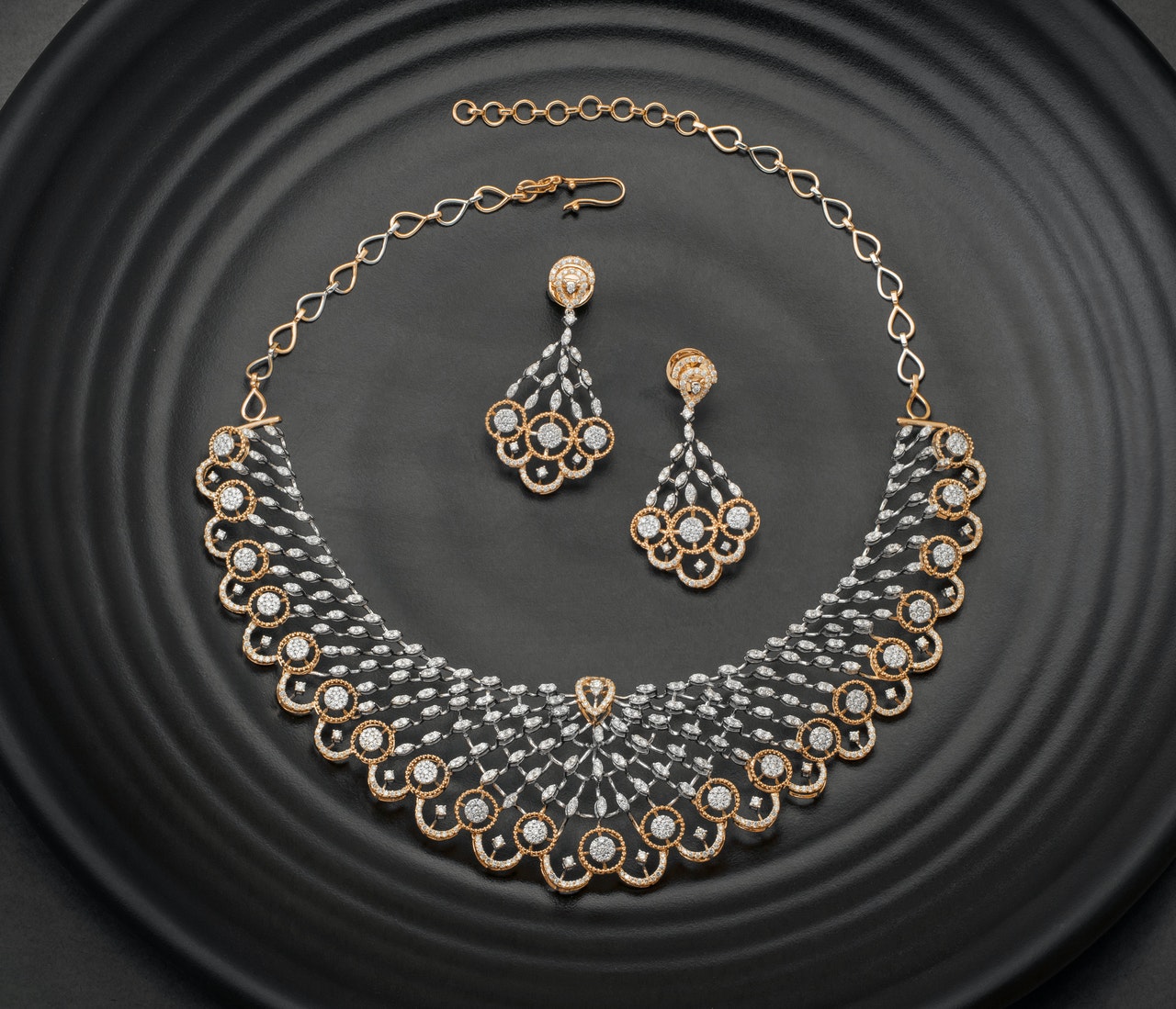
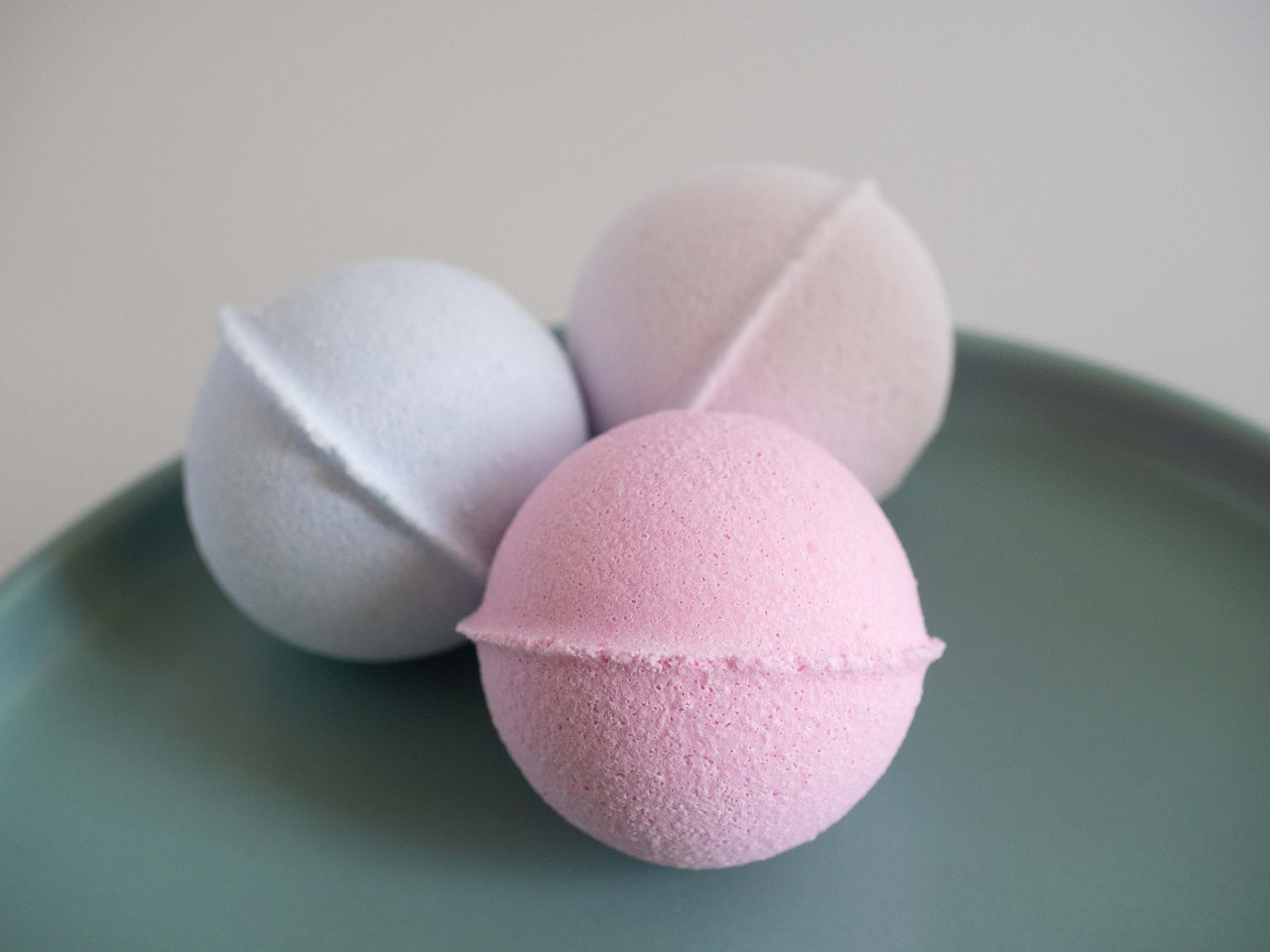
Example of Group
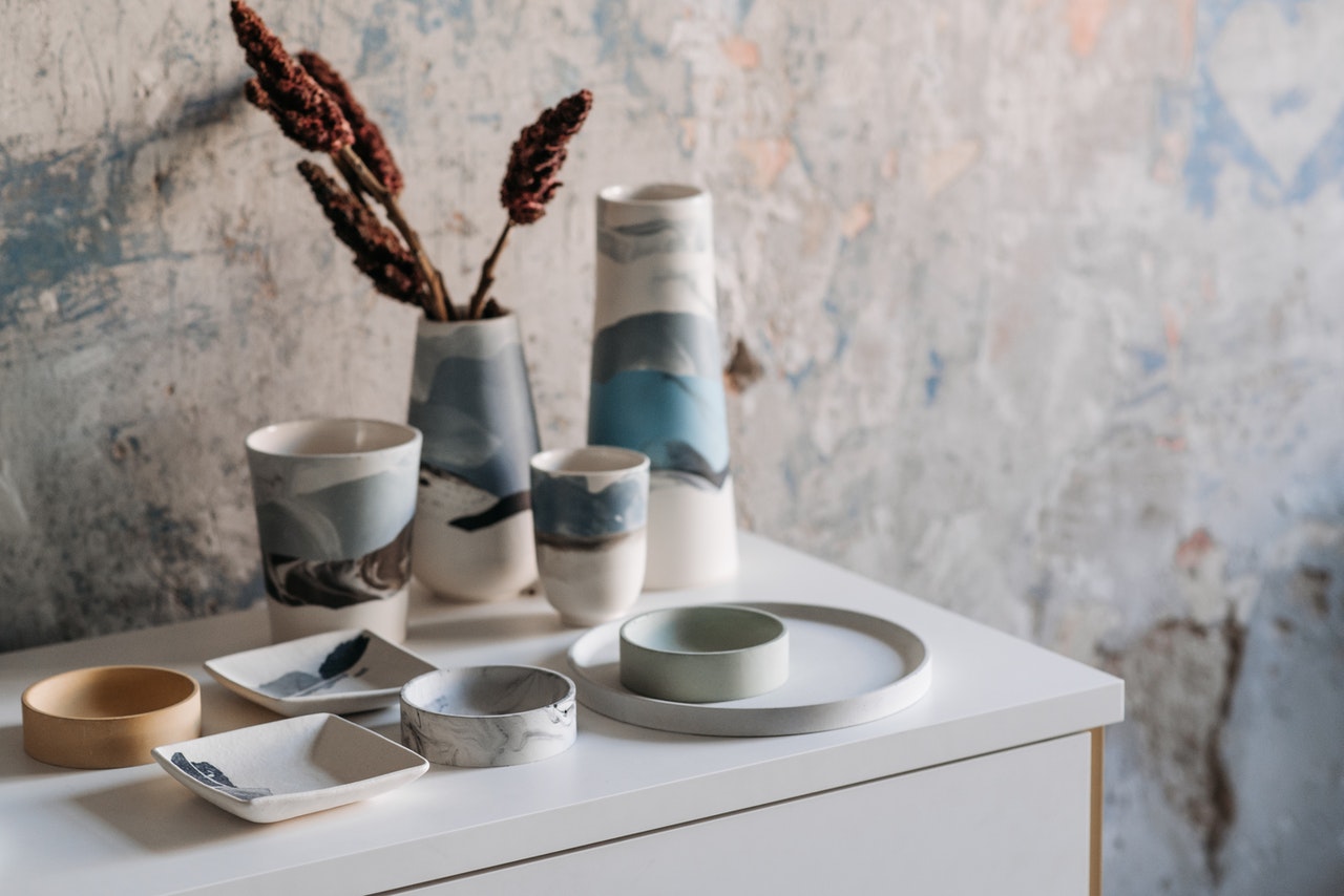
Example of Lifestyle
Example of Close Up
Editing your photos
Now that you have finished the photoshoot, you’ll have to edit your products for your Wix store.
Here are some tips you’ll want to follow
- Choose an editing software
- Optimize white balance
- Optimize file size
- Name each file for SEO
Editing software
If you are a little bit more advanced, you can use Lightroom or Photoshop to edit your photos.
However, if you are new and using a phone, you can use something like Snapseed or Canva.
Canva has background removal tools and you can edit certain aspects of your photo in their photo editor.
The other nice thing about Canva is that you can use frames like vertical or square so that your cropping stays consistent.
Optimize white balance
Remember a good editing software will let you optimize your white balance so your product looks as close to the color it is in real life.
Optimize your file size
There is nothing worse than a large photo that takes forever to load. Make sure that you same your images at a size that is reasonable for your theme and customer’s internet connection to load.
Here is a guide to resizing photos for your store that you should read through carefully.
Resizing photos is going to be one of the most important editing steps. If your photos are too big, your site will be slow.
A slow site will drive customers away!
Name each file for SEO
Finally, name each file.
You should come up with a file naming convention that makes sense to you and makes sense for search engines.
Your file name should be descriptive and should look something like this:
brand-name-white-shirt-womens-casual-sku-number
so that you can easily search it and something like Google can easily index it.
Wrapping it up
There you have it. If you want to take great product photos for your Wix store make sure you
- Gather the right equipment
- Create an on-brand style
- Pick the right angles
- Edit your photos properly
We hope this guide to taking great product photos will help you turn your shoppers into customers!


