We've all been there – browsing through websites, searching for that perfect product or service, and suddenly, we stumble upon a site that just feels… off.
Something about it doesn't quite sit right, so we hesitate to trust the brand.
In the vast ocean of eCommerce stores, where first impressions are everything, this is the last thing you want for your brand.
One of the most effective ways to establish credibility is through smart web design choices.
These decisions, made throughout the design phase of your site, are hugely influential in shaping how users perceive your brand.
When we talk about web design choices, we're not just referring to the visual aspects like layout and graphics.
Deeper design elements like persuasive copywriting and compelling value propositions affect how your visitors perceive your brand.
This article will explore the power of making intelligent web design choices and how they can boost your eCommerce brand's credibility.
We'll dive into the importance of:
- Clear communication,
- User-friendly navigation,
- and trust-building design elements.
Building your website with a clever design approach will allow your brand to stand out and foster trust and loyalty among your target audience.
Beautiful, simple reviews for your site
Easily collect, show & grow customer reviews, photos & videos for your business.Go the Extra Distance With Your Social Proof
Social proof is a powerful tool that can make all the difference when building substantial relationships with your audience.
But incorporating basic social proof elements isn't enough in today's competitive landscape.
To truly stand out and boost your brand's credibility, it's essential to go the extra distance and deliver on the best practices for social proof.
For eCommerce sites, this means going beyond making simple claims of your products' quality.
Instead, consider incorporating detailed customer feedback – including star ratings and reviews – on your product pages.
Additionally, leverage user-generated content, such as social media posts showcasing your products, to demonstrate their popularity and versatility.
Doing so will create a more engaging experience and promote confidence in your products' reliability.
You can easily handle this by utilizing the power of a review and ratings app like Fera.
That way, you can easily display your Facebook and Google reviews and ratings directly in your digital storefront.
Making your reviews SEO-friendly and maximizing your social proof efforts is also streamlined using tools like Fera Product Reviews.
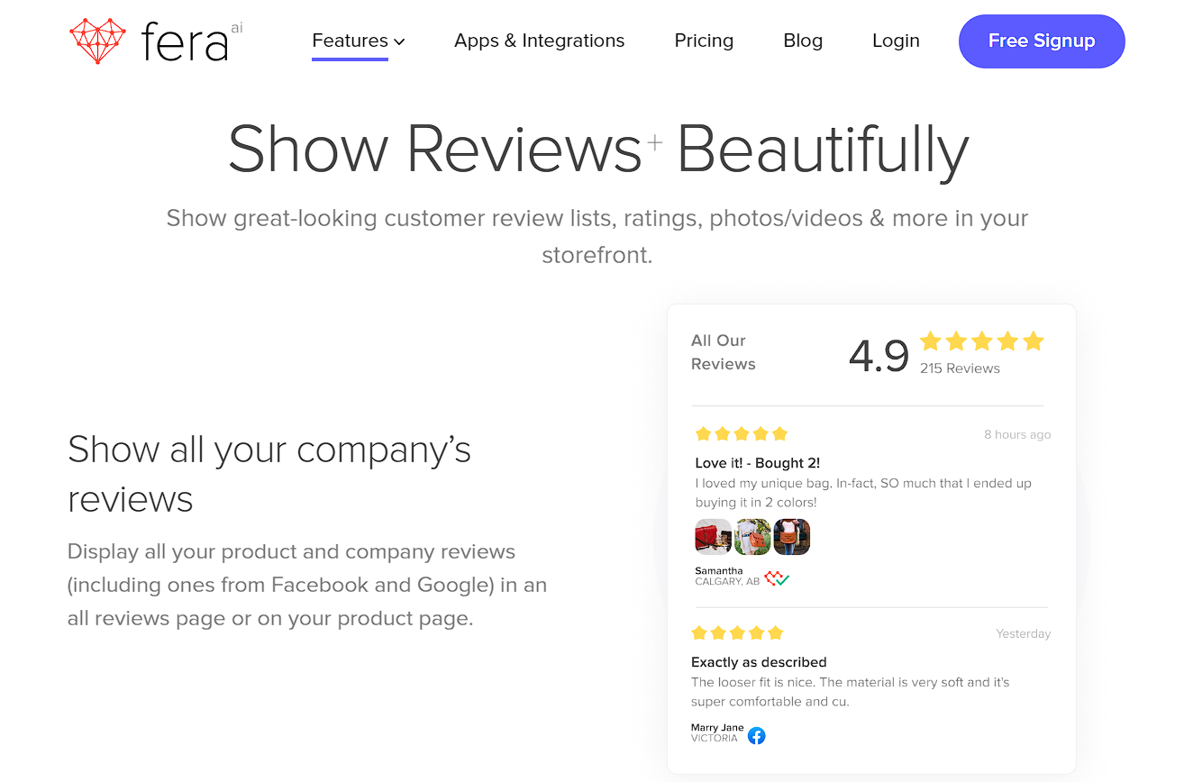
Source: Fera
Brands that offer services can gather testimonials as a critical component of social proof.
To enhance the impact of the testimonial, include the client's name and title, headshot, and company logo.
This extra detail adds authenticity and makes the testimonial relatable; Showcase a diverse range of clients, highlighting your versatility.
Example: SellerPlex
SellerPlex, an eCommerce sales and management platform, is a shining example of this practice.
Their testimonials section on their website uses all of the elements we've mentioned (clients' names, headshots, titles, and companies' names) accompanied with video testimonials of SellerPlex's clients praising their service.
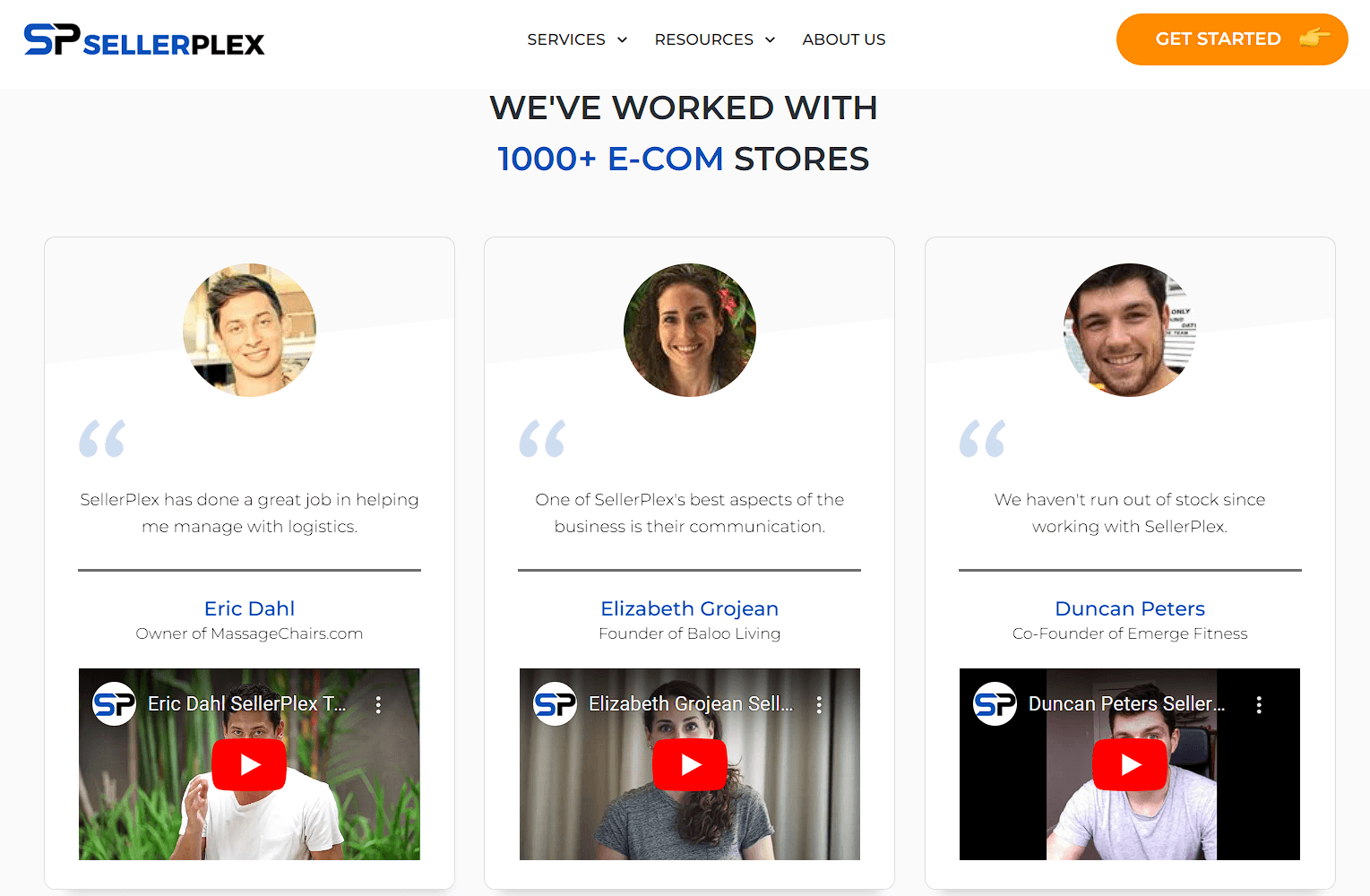
Source: SellerPlex.com
Highlight Trust Signals
Incorporating trust signals into your website design can instantly boost your brand's credibility.
These visual indicators reassure users that they can count on your brand and feel confident in their decision to engage with your products or services.
Some key trust signals to consider adding to your website include:
- Trust badges/seals: Display badges from well-known security providers, like Norton, McAfee, or SSL certificates, to demonstrate that your site is safe and secure.
- Verification badges: Third-party certification is so important to customers, and it shows that the company's claims can be trusted, making it easy to buy from them.
- Transactional security: Ensure your eCommerce platform uses secure payment gateways and displays the logos from trusted payment providers, such as Visa, Mastercard, or PayPal.
- Product accreditations: Showcase any industry-specific accreditations, certifications, or endorsements that your products or services have received, to highlight their quality and reliability.
- Brand memberships: If your brand is a member of reputable industry associations or organizations, display their logos to emphasize your commitment to industry standards and best practices.
- Certifications: Flaunt any certifications your team or company has earned that attest to your expertise and professionalism in your field.
Utilize these trust signals on your website to effectively communicate your brand's commitment to security, quality, and industry excellence.
Example: Figo
Figo, a top player in the pet insurance industry, does this by prominently showcasing endorsement and recognition badges in their header.
Having authoritative voices to vouch for them gives Figo's customers the necessary push to move down the sales funnel.
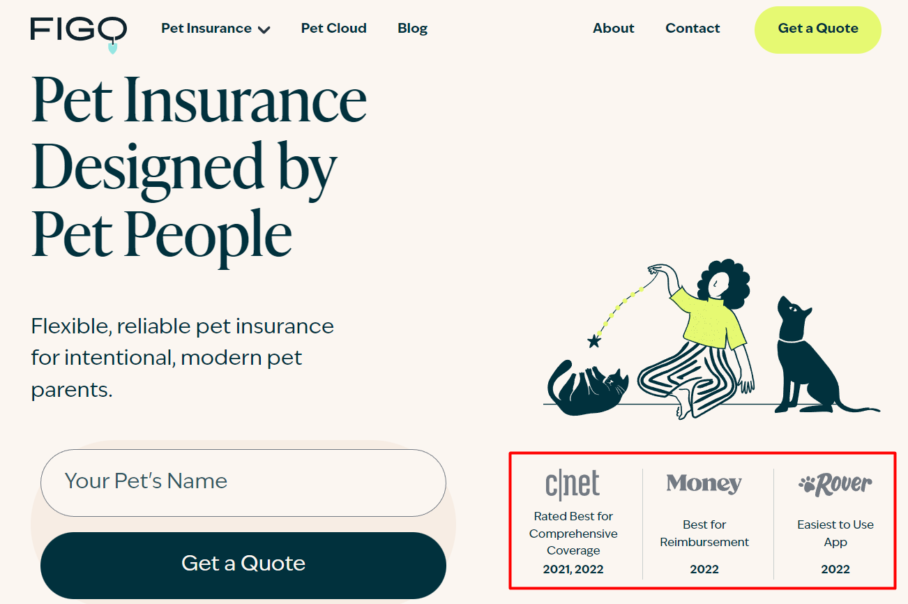
Source: Figopetinsurance.com
Example: PageFly
Another great example that uses quoting usage statistics as a trust signal is PageFly, a Shopify page builder tool.
Translating their service's reliability and success into numbers is a simple and effective way to tell newcomers why they should try them.
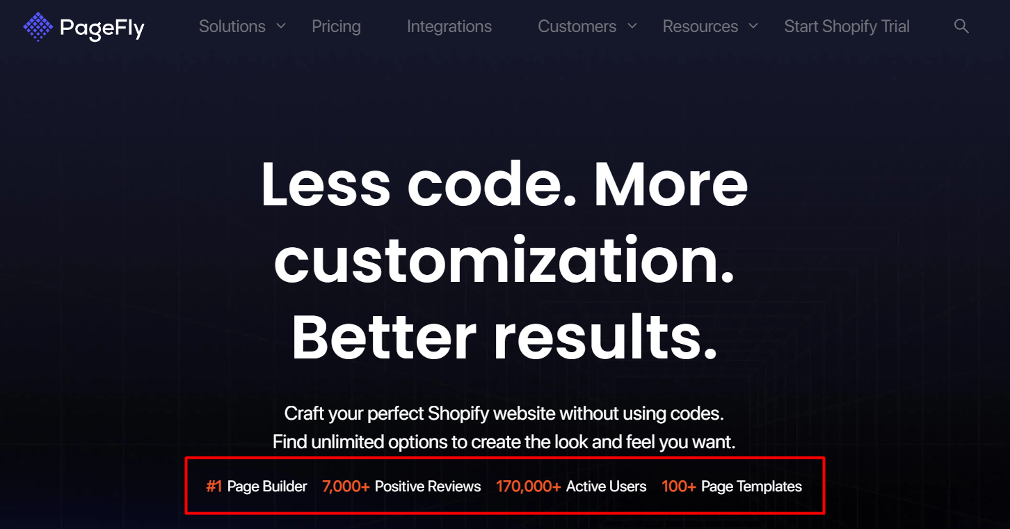
Source: PageFly.io
Tell Customer Stories With UGC
Real customers are often the most reliable source of trustworthiness for a brand's products/services.
The stories of how they experienced a product first-hand can be a valuable asset in the hands of a marketer.
UGC (user-generated content) is a powerful tool for boosting sales, showcasing authentic customer stories, and making your brand more relatable and trustworthy in the eyes of potential clients.
UGC can include a wide range of content, from customer reviews and testimonials to social media posts, images, and video reviews featuring your products or services.
By incorporating UGC into your web design, you invite visitors to see how others have benefited from your offerings, creating a sense of connection and trust.
Beautiful, simple reviews for your site
Easily collect, show & grow customer reviews, photos & videos for your business.This peer-to-peer sharing of experiences is invaluable in establishing credibility, as it demonstrates that real people are happy and satisfied with your brand.
Moreover, UGC allows for diverse perspectives, showcasing the range of individuals who have found value in your products or services.
This inclusivity highlights the versatility of your offerings and helps potential customers envision themselves benefiting from your brand.
Shop Solar Kits serves as a prime example of UGC done right.
This solar power systems company recognizes that sometimes, the most effective way to engage a wider audience is by letting their current customers do the talking.
By showcasing real-life examples of how their products are being used, they create a genuine connection with potential clients and demonstrate the value of their offerings in a relatable, down-to-earth manner.

Source: Shopsolarkits.com
Lead With a Great Value Proposition
Your website's header is like the opening act of a show – it sets the tone and determines whether your audience will stay engaged or lose interest.
Including a strong value proposition in this section will help demonstrate what you're all about.
A value proposition succinctly describes what your brand does for the customer and why it matters, answering the all-important question: "What's in it for me?"
To craft a compelling value proposition, try the following best practices:
- Be clear and concise: Aim to convey your message in as few words as possible, making it easy for visitors to grasp your brand's purpose quickly.
- Focus on benefits: Rather than simply listing features or technical specifications, highlight the tangible advantages your customers will experience.
- Make it unique: Identify what sets your brand apart from competitors, and emphasize this in your value proposition to establish your niche in the market.
- Reinforce with visuals: Choose images, graphics, or videos that illustrate the benefits of your products or services, helping users envision themselves enjoying these advantages. These visuals should complement your value proposition, making it even more memorable and impactful.
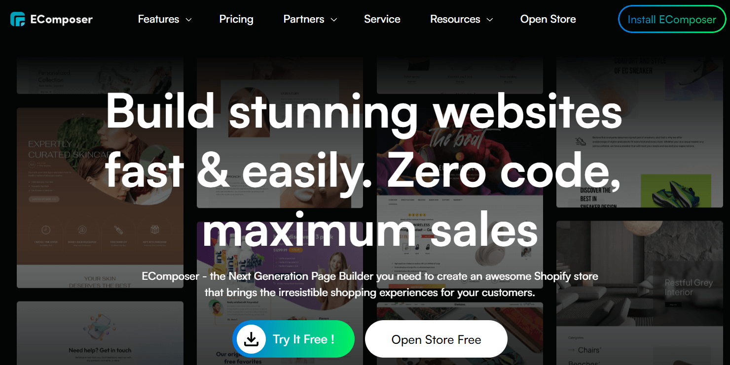
Example: Ecomposer
EComposer is another Shopify page builder that capitalizes on this strategy.
Their value proposition is captivating from the get-go, laying the foundation for trust and credibility as visitors explore the website further.
Source: Ecomposer.io
Lower the Stakes for Conversion
We've all encountered brands that seem to care only about our wallets.
In response, people are naturally drawn to brands that care and make great efforts to appease their customers.
And the brands that care enjoy a more significant following and are generally more successful.
If your product offers a free trial, no-commitment plan, or any other feature that helps ease the concerns of this segment of people, emphasize this in your call-to-action (CTA) elements.
By highlighting low-risk options, you show your audience that you're confident in your product or service and that you prioritize their satisfaction over making a quick sale.
This approach helps alleviate potential customers' fears and encourages them to take the plunge, knowing they can test the waters without feeling pressured or locked into a long-term commitment.
When crafting your CTAs for your eCommerce site, be crystal clear about the benefits of your low-risk offerings.
Also, make sure to position these CTAs throughout your site strategically.
For example, place them near your value proposition, product descriptions, or pricing information to catch shoppers’ attention who may be on the fence about trying your product or service.
Example: Aura
Amazon repricer Aura indicates that the conversion costs the user nothing.
They do this by amending the typical CTA button design with a noticeable (but unobtrusive) design element that simply shows the word FREE.
They follow this up with a signup page that prominently displays a message all SaaS customers want to see: "No credit card required."

Source: Goaura.com
This message combination communicates something very specific to the potential customer: "We have confidence that our product will prove its worth to you during the trial period."
Design a UI That Resonates With Your Target Audience
Understanding the preferences and expectations of your users is of utmost importance when tailoring your site's design accordingly.
Two contrasting design approaches are the "minimalist" and "dense" styles, each catering to different audience segments.
Clean lines, ample white space, and a focus on simplicity characterize a minimalist design.
This approach suits brands targeting audiences who prefer quick, easily digestible information.
Minimalist UIs often prioritize visual elements and concise, impactful text, ensuring users can access the information they need with minimal effort.
This design style fosters a sense of ease and efficiency, making it a popular choice for brands in fast-paced industries or those offering straightforward products or services.
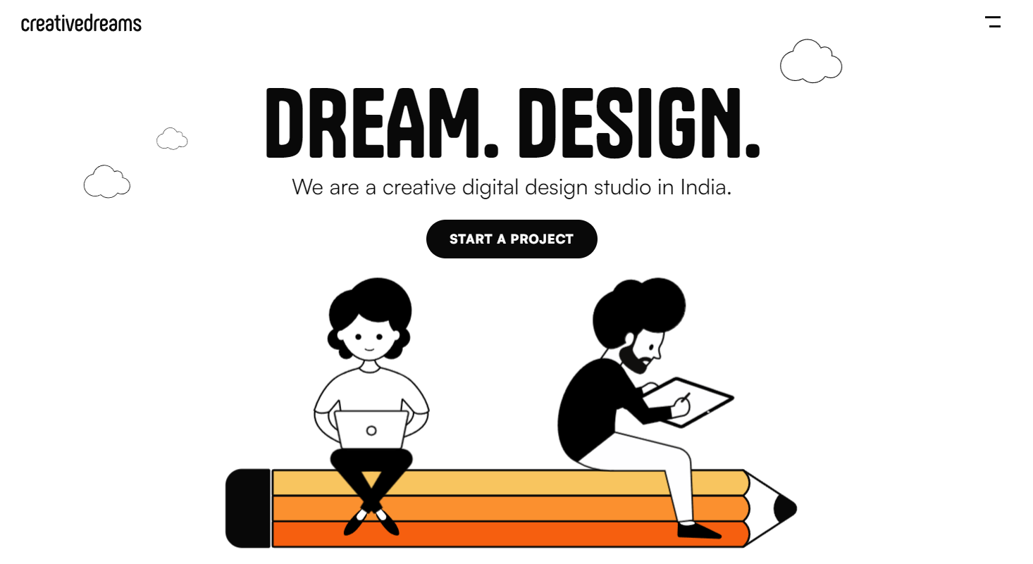
Example: Creative Dreams Design
Creative Dreams Design, a digital design company, uses a simple, monochrome design for their website that honors clever animation and tons of negative space to put focus on their service and design skills.
Their approach is perfectly suitable regarding the type of visitors their website welcomes.
Source: Creativedreams.design
On the other hand, a dense UI features a more complex layout with a wealth of information, catering to an audience accustomed to processing large amounts of data.
These users often expect to find detailed, in-depth content when visiting your site and may feel more comfortable navigating a dense interface.
Brands that provide specialized products or services, or those targeting expert-level users, might benefit from this design approach, as it demonstrates a commitment to delivering comprehensive, thorough information.
Describe Your Product Clearly
To effectively communicate your product's value, your website should employ a combination of text, visuals, videos, graphics, animations, and design elements that describe your product in a clear, concise manner.
Striking the right balance between brevity and conveying important information is critical to captivating and retaining your visitors' attention.
For instance, consider using short paragraphs or bullet points to highlight key features and benefits, making it easy for users to grasp the value of your product quickly.
Accompany these written descriptions with high-quality visuals, such as product images or explainer videos, to reinforce your message and create a more engaging experience.
Remember, the goal is to help potential customers envision themselves using and benefiting from your product.
Another effective approach is to use a mix of animations and interactive elements to showcase your product in action.
This adds a dynamic touch to your site and helps break down complex concepts into easily digestible pieces of information.
Example: Trustshoring
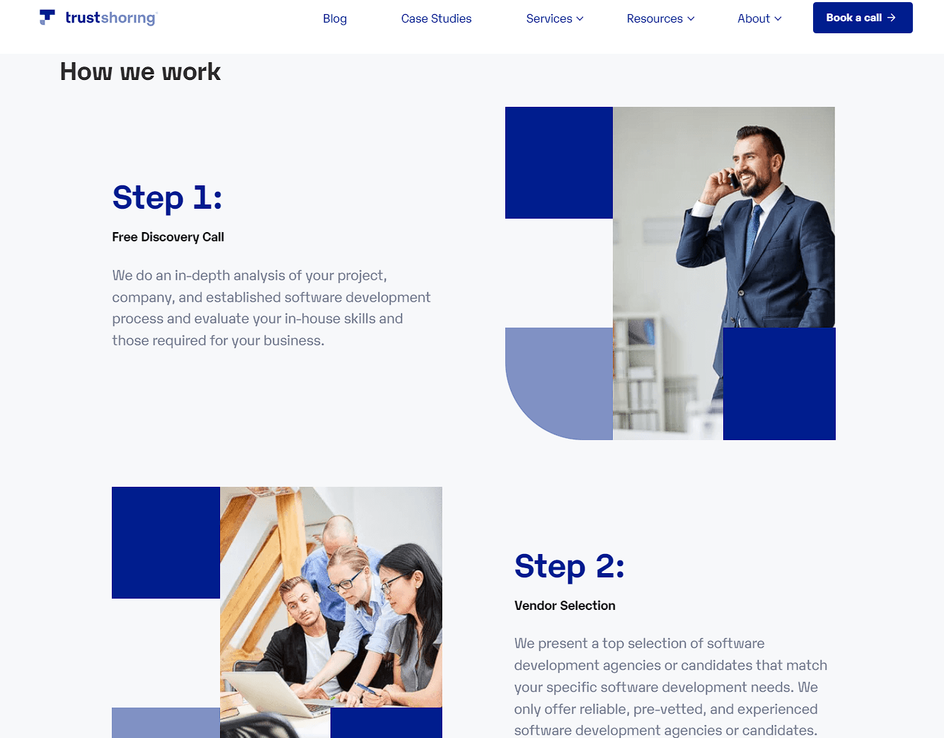
You'll find a great example of a clear product description from Trustshoring – a software developer recruitment agency.
Their website combines minimalistic design with concise text and engaging visuals, effectively highlighting their services' unique features and benefits.
The "How we work" section on their homepage includes a straightforward 4-step explanation, creating a compelling product presentation that resonates with your target audience.
Source: Trustshoring.com
Highlight Your Availability
Creating a sense of presence and accessibility can go a long way in building trust with your audience.
By emphasizing your availability and highlighting your real-world existence, you can reassure potential customers that your brand is not just a faceless online entity but a genuine business ready to address their needs and concerns.
To convey this sense of availability, consider incorporating the following elements:
- Contact information: Display your physical address, telephone number, and email prominently on your site, reinforcing the notion that you're accessible and ready to assist.
- Chat feature: Implement a live chat function staffed by real salespeople or customer support representatives, offering visitors instant access to personalized assistance and guidance.
- Call-to-action (CTA): Encourage users to get in touch with you through clear, inviting CTAs, such as "Talk to our experts" or "Schedule a consultation," to demonstrate your willingness to engage with your audience.
- Social media presence: Link to your social media profiles, showcasing your active online presence and emphasizing your availability to engage with customers across multiple platforms.
Additionally, sharing stories or images of your physical location, team members, or events can further humanize your brand and make it feel more grounded in the real world.
This approach helps forge an emotional connection with your audience, fostering trust and loyalty.
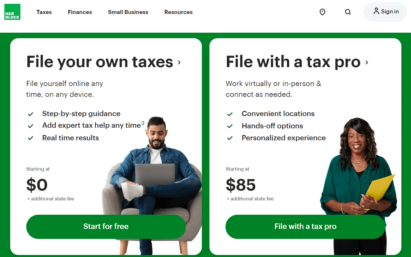
Example: H&R Block
For instance, H&R Block, a tax preparation company primarily an online legal services platform, encourages clients to visit their local offices for personalized consultations, tax advice, and face-to-face assistance in navigating tax-related matters.
Doing so enhances their customers' experience and builds lasting relationships with their clientele.
Source: Hrblock.com
Example: Bay Alarm Medical
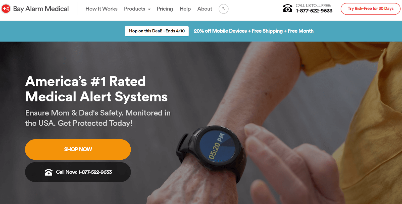
Bay Alarm Medical, a medical alert systems supplier, is a perfect example of encouraging phone calls because this is a communication mode that their customer base of older adults would typically be comfortable with.
They make this message/CTA obvious in two places above the scroll line of their website.
For extra convenience, the CTA launches Skype when clicked.
Source: Bayalarmmedical.com
Beautiful, simple reviews for your site
Easily collect, show & grow customer reviews, photos & videos for your business.Final Thoughts
Keep in mind that your website is your digital handshake.
By making smart web design choices, you're giving your audience a warm, inviting, and trustworthy welcome.
By connecting with them through social proof, trust signals, and clear communication, you're building a strong foundation for long-lasting relationships.


