Do you have a bad sales conversion rate?
Are you looking for a way to improve them?
Your call to action button (CTA) is a fundamental part of your entire marketing campaign.
It’s also the difference between losing a possible customer and securing a sale.
However, there are certain CTA phrases that work a lot better than others.
So, that’s why in this article, we will be advancing through the 7 of the best eCommerce CTA examples that you can implement on your own website today.
What Is a Call to Action?
In the eCommerce world, a call to action (CTA) is a word or expression that persuades people to take a particular action and encourage an immediate sale.
It's generally placed in the form of a button in a noticeable spot on your webpage.
With the proper call to action, you will be able to convince the viewer to do something specific, such as:
- Purchase a product
- Get a service
- Register for a newsletter
The 3 C’s in a Call to Action
In this specific section, we will break down the 3 C’s in Call To Action.

Call
Use the first-person approach and be more authoritative.
Just by changing a simple pronoun, you can significantly increase the success of your call to action.
For instance, try to compare these 2 “call to action” expressions:
- Are You Prepared to Subscribe?
- Subscribe To My Blog Right Now!
Even though both of the sentences are pretty much the same, which of the above-mentioned sentences catches your attention?
The second one.
That’s because the phrase is in first-person and tells the viewer precisely what to do.
Convince
Keep it simple but precise.
Use a voice that your customers will understand and create a process that makes sense.
As a business owner, you already know where you want your customers to go.
However, does your buyer know that?
Probably not!
So, you will need to nudge him in the right direction and convince them to make the final checkout.
Convert
You can’t just assume that a perfectly-written CTA will resonate with your viewers.
Every audience has different personalities and requirements.
Instead, use A/B testing to see what is working and what isn't.
Try out new methods until you finally find something that will be proper for your eCommerce website.
The Most Compelling Call To Action Examples To Increase Sales Conversion
1. “Shop Now” Button
"Shop Now" is unquestionably one of the most popular call-to-action phrases.
Even though it may sound simple and may seem pretty obvious, it actually works and assists in improving your overall sales conversion rates.
Typically, most eCommerce businesses place this button near their promotional or one-time offers.
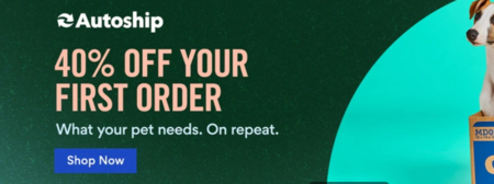
In this picture, Chewy informs their customers that they will get a 40% off on their first sale, and right below that statement, they have included a simple CTA button "Shop Now.”
2. Would You Like To "Y"? Yes or No
In this specific case, you're combining a headline with a CTA button.
The headline is “Would You Like To Y?” And the CTA is “Yes,” but you're also offering a “No” alternative.
The “Y” part could literally be anything: a discount, free shipping, free eBook, or any other incentive.
For instance, KISSmetricks presents a perfect example of how you can implement this technique to your website.
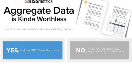
They offered their viewers a free case study and two options.
The first option is "Yes, Get the Case Study Now," and the second one is "No, I'd rather not know how the marketing is performing."
Since most people feel uncomfortable agreeing with the second statement, they will click on the "Yes" button.
Notice how they structured their call to action:
- Told the users precisely what they would receive (the case study)
- Made the alternative sound pretty off-putting
3. You Have Limited Time!
The fear of missing out (FOMO) on something is the worst feeling!
So, by telling your customers they have a limited time to act on something, you're creating urgency and scarcity.
This way, they will be pushed to make a decision faster.
If you know how to use this strategy, you can significantly boost your sales.
Variations on this CTA could include the next:
- Act before it’s too late!
- Claim your discount before it’s gone!
- Don’t miss out on this promotion!
- Limited quantities!
- Order today for next-day delivery!
- Hurry! Only 2 left in your size!
Boohoo has a great sample of how you can add this strategy to your own website.
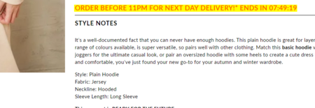
They create urgency by telling their customers that they need to order before 11 PM if they want to get next-day delivery.
Along with this, they've also added a timer that counts how much time is left!
4. Start For Free Offer
People love getting something for free!
So, that's why businesses sprinkle the word "free" everywhere - and, for the most part, it actually works.
If you have any kind of free services or even a free trial, then why not emphasize it?
Who knows, maybe when customers see that your service or product is something that works for them/in their lives, they might be willing to sign up for the premium version or continue their trial.
Fera.ai (one of the highest-rated product review apps) has applied this technique quite well.
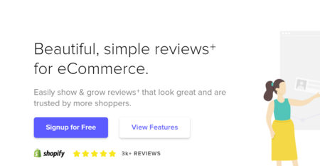
They have a blue "Sign Up For Free" button that's located on their homepage.
Therefore, all of the potential customers will be able to see it and get the free offer.
5. Revisit your Abandoned Cart
There are many buyers that add their favorite products to their carts and then forget to make the final step - checkout.
However, don't worry because they are the easiest customers to convert as they have already visited your site, liked your product/service, and have almost made the purchasing decision.
All it takes is a simple push.
But, how will you do that?
Well, simply place an irresistible eCommerce call to action!
The most efficient way to perform this is by offering free delivery or a special discount code on the particular product that is already in their shopping carts.
This will encourage the buyers to quickly fall for the offer and ultimately finish the order.
Instead of using the “Go To Cart" or "Buy Now,” but try using:
- Title: "Did you forget to purchase your "SAMPLE" item? Well, you're in luck because it just became eligible for a 20% discount."
- CTA Button: "Yes, I totally forgot" or "I'm prepared to seize this discount.”
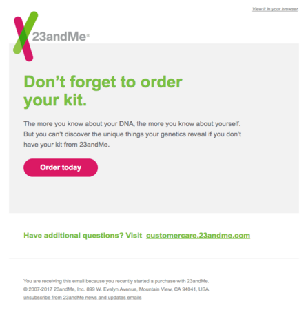
For instance, 23andMe has a great sample of how you should approach your abandoned customers.
They reminded their potential buyers about the service they were looking at while also stating the benefits they would receive if they considered closing the deal.
To make everything more seamless, they’ve also added a small little "Order Now" button.
6. Join "Y" Others as Subscribers to My Email List
If you have a large email list, then why not use it to your advantage.
After all, you did all the hard work to collect all those emails!
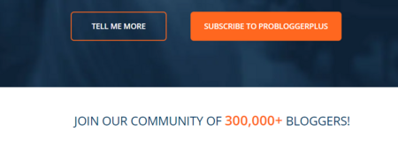
When people see big numbers, they start wondering why thousands or even millions of people are so excited about what you have to say.
So they feel more inclined to join your program as well.
Here are a couple of interesting examples that you can use:
- Join 255,000 other marketers and subscribe to our blog.
- Become one of the 52,351 people who subscribe to my email campaign.
- Join our club! Over 10,000 fitness enthusiasts request my emails. You can, too!
7. Begin Your Journey Toward Y
Some of the CTA phrases clearly describe the benefits of clicking on the button.
They will let users know what he or she will get in exchange for providing an email or purchasing the product/service.
Generally, most businesses use this type of approach, "Begin Your Journey Toward Y."
In this particular case, the "Y" is the result.
Here are a few examples, just so that you can get a better picture of what we're talking about:
- Begin your journey toward successful weight loss
- Get the best tips from the best wealth advisors. Become better with your money!
- Start learning new foreign languages
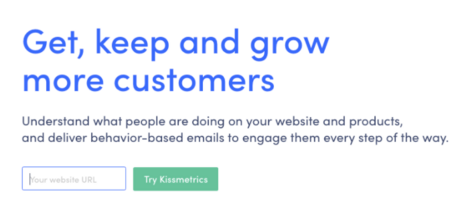
Kissmetrics has addressed the benefits of adding their service - “Get, keep, and grow more customers.”
It’s straightforward, but they’ve reported that they’ve seen a massive rise in their sales conversion rates.
Summary
If you remember the the C's in the Call to Actions, you can convince your buyers to follow through.
With the help of our 7 eCommerce CTA examples, you will be able to improve your sales conversions in no time.
